libbrailleReading by touch

An independent publication about braille and tactile reading. A C library called libbraille was once one of the pieces of software that let Linux drive a braille display. This publication is not that software and has nothing to do with it.

libbraille / The Six Dots

Position 1 · The Six Dots

What Came Before the Cell

The six-dot cell was not the obvious answer. Several competing systems got there first — and some of them worked.

Moon type embossed letterforms tactile reading page
01

The Age of Embossed Letters

When Louis Braille published his system in 1829, he was entering a crowded field. The assumption driving most early tactile writing was logical enough: blind readers would find it easier to learn a system that used the same letter shapes already in circulation. Why invent a new alphabet when one existed?

The most durable of the embossed-letter systems was Moon type, developed by William Moon in Brighton in 1845. Moon simplified the Roman alphabet into a set of curves and angles, dropping the fine detail that made print letters hard to distinguish by touch. The shapes were large, unambiguous, and required relatively little training to read. Moon type was still being produced in Britain through most of the twentieth century and remains in limited use today, particularly among people who lose their sight later in life and find the abstract dot patterns of braille harder to acquire.

Boston Line Type, introduced by Samuel Gridley Howe at the Perkins School for the Blind in Massachusetts in the 1830s, took a different approach: it embossed a modified Roman letterform in a flowing, angular style designed to keep the strokes legible under a fingertip. Howe was a committed advocate and an effective institution-builder, and Boston Line Type was the dominant system in American schools for several decades. The Edinburgh system, developed at the Edinburgh Institution for the Blind, similarly worked from modified letterforms, competing with other regional variants across Britain and Europe in a period when there was no consensus and each school tended to adopt whatever its founders preferred.

These were serious attempts by serious people. The embossed-letter camp had a coherent argument: a system that shared its alphabet with print allowed sighted teachers to read what their students wrote, enabled the production of books without specialist typographers, and gave blind readers access to the same letterforms used in the wider world. The argument was not frivolous. It lost anyway.

02

Why the Cell Won

The problem with embossed letterforms is geometrical. A Roman letter must be large enough that its distinguishing features — the difference between an e and a c, between an n and an m — can be resolved by touch rather than sight. Touch is a high-resolution sense in the right conditions, but fingertip resolution is not uniform: the ability to distinguish two adjacent points peaks at the pad of the finger and falls off quickly toward the sides. More critically, the spatial sweep required to read a letterform is fundamentally different from the sweep required to read a dot pattern.

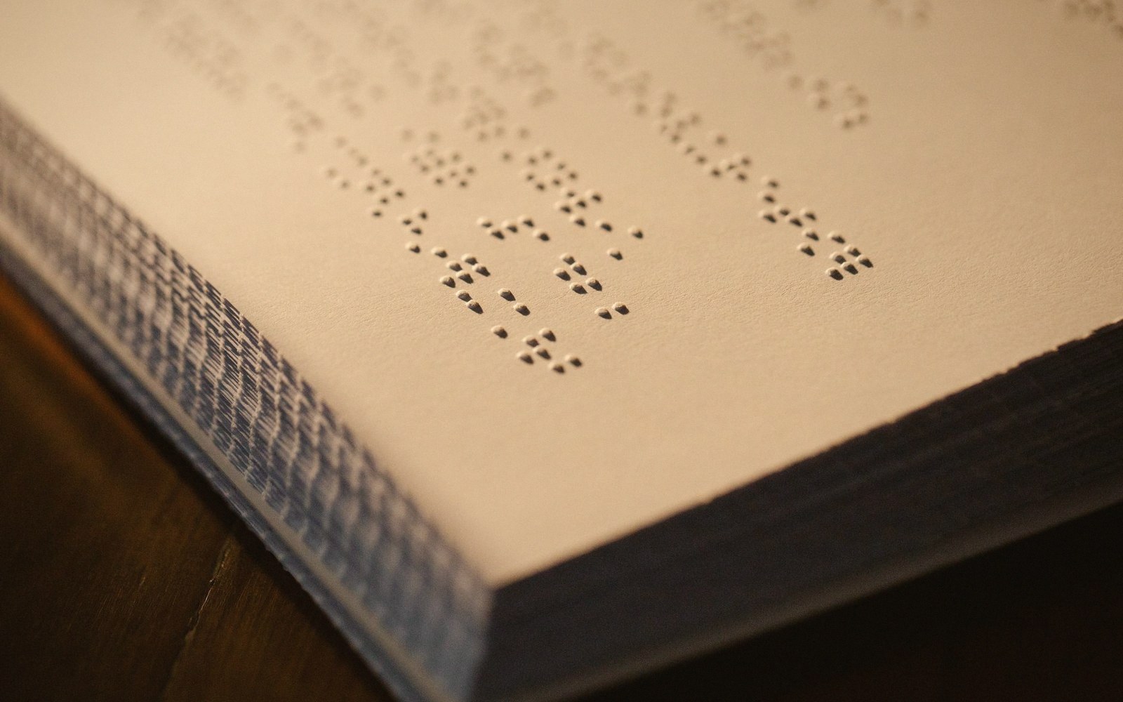
A tactile reader moves a fingertip across a line of text. With embossed letters, that finger must trace a continuous curve and interpret it as a shape — the kind of processing the visual system does effortlessly but which touch performs slowly and with effort. Braille's cell sidesteps this entirely. Six dots arranged in a fixed grid of two columns and three rows give the fingertip a bounded region, smaller than a fingertip's width, that encodes a character not as a shape to trace but as a pattern to feel at once. The reading unit becomes a spatial snapshot rather than a line to follow.

The cell's dimensions — standardised at roughly 6 mm tall by 4 mm wide, with 2.5 mm between dot centres — were arrived at through practice and refinement, not theory. But they fit the physiological facts of fingertip resolution almost exactly. There is a reason the six-dot cell has the dimensions it does: larger would require more travel, smaller would blur the dots into indistinction.

This is the core of the argument. The embossed-letter systems were not inferior ideas; they were solutions to the wrong constraint. They optimised for legibility in print terms — for a visual code translated into touch — and that translation imposed a cost at every reading stroke. Braille's cell was designed entirely for touch from the start, and its economy showed in reading speed, in the size of books, and ultimately in the willingness of schools to standardise on it.

Speed mattered practically as well as abstractly. A reader who can move through text faster learns more, writes faster, participates more fully in a literate culture. The case studies assembled by braille's advocates in the mid-nineteenth century consistently showed faster tactile reading with dot-based systems than with embossed letters, and that data shifted institutional opinion even among Howe's successors at Perkins.

The last significant holdout in the anglophone world, Moon type, survived precisely because it serves a different population — late-onset readers with less time for training — rather than because it competed with braille on braille's own terms. That accommodation to a different use case is not a failure. It is the sign of a system that found its actual niche.

What the embossed-letter era teaches is a design principle that applies well beyond tactile writing: the right form for a medium is the one that exploits the medium's own strengths, not the one that most faithfully copies a form invented for a different medium.